The Psychology of Color in Photography: How to Use Color to Influence Mood and Perception
Color is more than just a visual element in photography; it’s a powerful tool that can influence mood, convey emotions, and shape the viewer’s perception of your image. Understanding the psychology of color can elevate your work, allowing you to use color strategically to enhance your storytelling and evoke the desired response from your audience.
Understanding Color Psychology
Color psychology is the study of how colors affect human emotions and behavior. In photography, this means recognizing how different hues can alter the mood of an image and influence the viewer’s perception. Here’s a breakdown of how various colors can evoke different feelings and reactions:
- Red: Red is a powerful and intense color often associated with passion, excitement, and urgency. It can create a sense of drama or highlight a subject. Use red to draw attention or evoke strong emotions, but be mindful that too much red can be overwhelming.
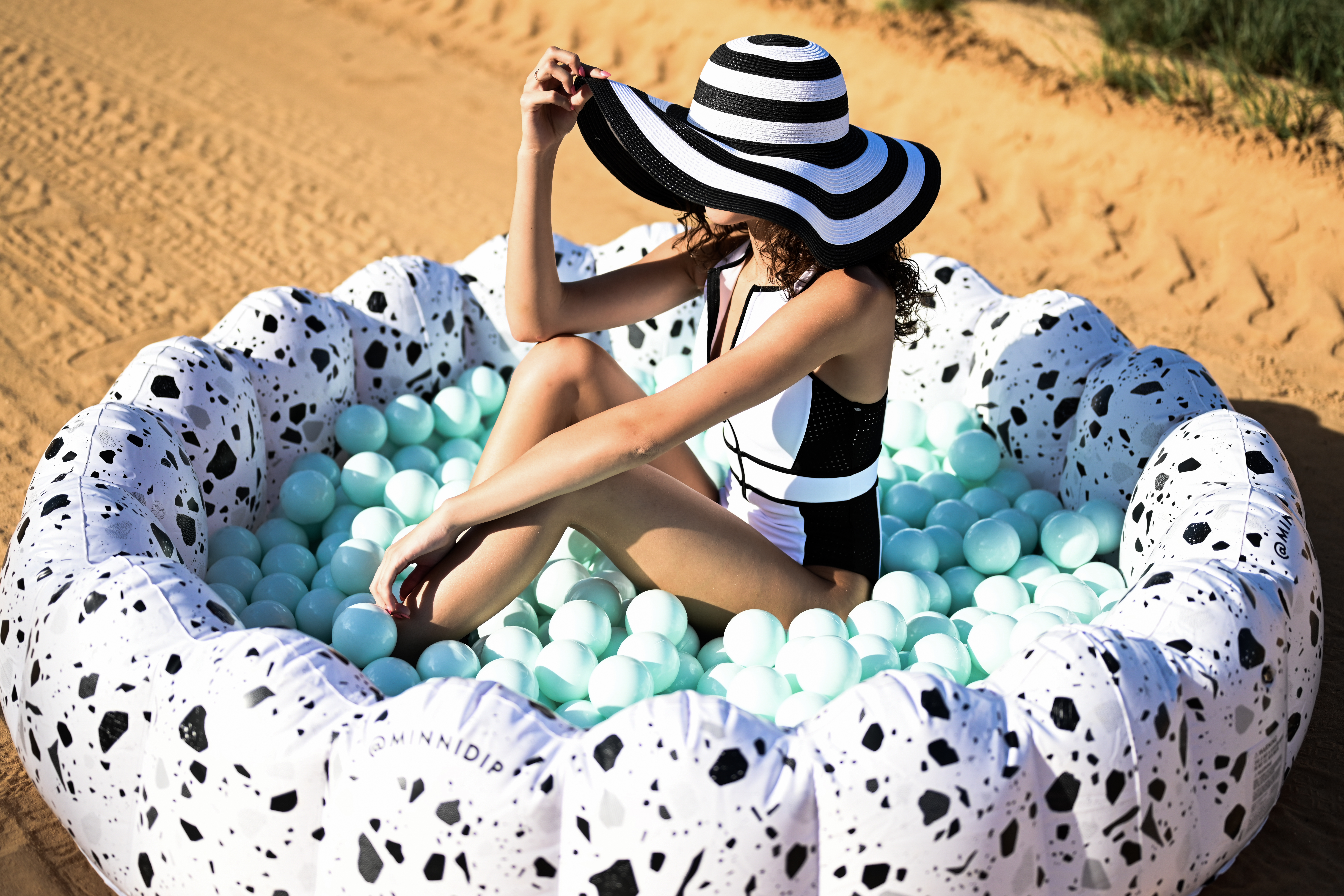
- Blue: Blue is calming and serene, often linked to tranquility, trust, and stability. It’s a great color for creating peaceful and relaxed atmospheres. Different shades of blue can range from comforting (light blue) to more somber or professional (dark blue).
- Yellow: Yellow exudes warmth, optimism, and energy. It’s often associated with happiness and positivity. Incorporate yellow to infuse your photos with a sense of cheerfulness and vitality, but be cautious with bright yellows, which can sometimes be overpowering.
- Green: Green symbolizes nature, growth, and renewal. It’s soothing and balanced, making it ideal for conveying a sense of harmony and health. Green can be used to emphasize environmental themes or create a refreshing, organic feel.
- Purple: Purple is often associated with luxury, creativity, and mystery. It can add a touch of elegance and sophistication to your photos. Light purple can be gentle and romantic, while dark purple can be rich and dramatic.
- Orange: Orange is vibrant and energetic, combining the warmth of red and the cheerfulness of yellow. It’s a great choice for conveying enthusiasm and creativity. Use orange to add a playful or adventurous tone to your images.
- Black: Black is classic, elegant, and powerful. It can add depth and contrast to your photos and is often used to create a dramatic or sophisticated effect. Black can also be used to evoke a sense of mystery or formality.
- White: White represents purity, simplicity, and clarity. It’s effective for creating a clean, minimalist look and can evoke feelings of peace and openness. White backgrounds can help other colors or subjects stand out and be the focal point.
Using Color in Your Photography
- Color Harmony: To create visually pleasing images, consider color harmony. Use complementary colors (opposites on the color wheel) for high contrast and vibrant visuals, or analogous colors (next to each other on the color wheel) for more harmonious and cohesive compositions.
- Color Temperature: Warm colors (reds, oranges, yellows) tend to advance and can make subjects appear closer, while cool colors (blues, greens) recede and create a sense of distance. Understanding this can help you manipulate the depth and spatial relationships in your photos.
- Monochromatic Schemes: Using varying shades of a single color can create a cohesive and soothing look. This approach is particularly effective in minimalist photography and can help focus the viewer’s attention on texture and form rather than color contrasts.
- Color in Storytelling: Think about the story you want to tell with your image. Choose colors that reinforce the narrative or theme. For example, a photo capturing a serene landscape might benefit from cool, muted tones, while a vibrant cityscape might be best highlighted with bold, dynamic colors.
- Post-Processing: In post-production, you can adjust colors to enhance the mood or correct any color imbalances. Tools in software like Adobe Lightroom or Photoshop allow you to fine-tune colors, adjust saturation, and create color gradients that align with your vision.
Color is a crucial element in photography that goes beyond aesthetics. By understanding the psychological impact of different colors and strategically incorporating them into your images, you can influence how your photos are perceived and evoke specific emotional responses. Experiment with color in your compositions, and let its power enhance your storytelling and artistic expression. As you develop your own style, remember that the thoughtful use of color can transform an ordinary photo into a powerful visual experience.